
Identity | Website | Print
Preformatex
Your content goes here. Edit or remove this text inline or in the module Content settings. You can also style every aspect of this content in the module Design settings and even apply custom CSS to this text in the module Advanced settings.
RESULTS IN NUMBERS:
%
Increase in website traffic
Catalog visualizations
Professionals visited our booths
Overview
Your content goes here. Edit or remove this text inline or in the module Content settings. You can also style every aspect of this content in the module Design settings and even apply custom CSS to this text in the module Advanced settings.
TIMELINE
- Full-time employee (1 Year)
TOOLS
- Adobe Cloud
- WordPress
- Notion
ROLE
- In-House designer, UX/UI, Photographer
B2B PROJECT
From fragmented to fluent: A complete brand transformation
UI/UX DIGITAL DESIGN MARKETING BRANDING PHOTOGRAPHY GRAPHIC DESIGN
The company decided it wanted to modernize its design approach. Until then, it had occasionally collaborated with an external agency, but it now sought to bring a designer in-house, someone who could deeply understand the niche product and handle both design and promotional materials.
UI/UX DIGITAL DESIGN MARKETING BRANDING PHOTOGRAPHY GRAPHIC DESIGN
JUMP TO SECTION:
Process Overview
Research & Analysis
DESIGN DIRECTION
Implementation & Development
Internal Review & Iteration
Launch & Ongoing Improvement
BRANDING · DIGITAL DESIGN · UX/UI · MARKETING · PHOTOGRAPHY · GRAPHIC DESIGN
CHALLENGE
FREELANCER, 2022 – 2023
- Web Design: Custom layouts, adaptative design, UX optimization
- Development: WordPress & Woocommerce
- Managment: Client & project coordination
NEEDS
FREELANCER, 2022 – 2023
- Web Design: Custom layouts, adaptative design, UX optimization
- Development: WordPress & Woocommerce
- Managment: Client & project coordination
THE SOLUTION
FREELANCER, 2022 – 2023
- Web Design: Custom layouts, adaptative design, UX optimization
- Development: WordPress & Woocommerce
- Managment: Client & project coordination
CATALOG · WEBSITE · FAIR BOOTH · EMAIL CAMPAIGN · SOCIAL MEDIA POST · MERCH
Reaserch:
LOOKING INWARD
I started by exploring everything Preformatex already had: their website, catalog, printed materials, and social media. Talking with the team helped me understand their goals for the brand, the essence of their product, and how they wanted to stand out from competitors.
BRAND
At the start of the project, Preformatex had recently updated its logo through an external studio, but the new identity hadn’t been implemented across any materials. The visual resources were minimal, which made it necessary to evaluate how the refreshed identity could evolve into a complete and consistent visual system.
AUDIENCE
Preformatex’s main audience consists of professionals in the textile and swimwear industry, designers, product developers, and manufacturers looking for quality foam cups and preformed materials. This is a highly specialized B2B audience that values technical information, reliability, and innovation.
Understanding their needs helped shape both the tone and design direction of the project: clear communication, updated visuals, and functional resources that made it easier for them to find what they needed and trust the brand.
COMPETITORS
As part of the research phase, we analyzed Preformatex’s main competitors, focusing primarily on European brands with similar delivery times and price ranges. The product itself is quite specific, so there are relatively few competitors specialized in this type of B2B foam cup production. While Chinese manufacturers offer much lower prices, their products differ in quality and involve considerably longer delivery times, largely due to production and logistics. Within the European market, our main benchmark was Muehlmeier, a German company with a long history in the field. This comparison helped us better understand Preformatex’s positioning as a reliable, high-quality European supplier.
KEY TAKEAWAYS
- Untapped Brand Potential: The recent logo redesign provided a solid foundation, but the brand lacked a cohesive visual system and consistent implementation across channels.
- Specialized Market: The product operates in a niche B2B sector with few specialized European competitors, giving Preformatex a strong opportunity to stand out through clear communication and visual identity.
- Need for Alignment: There was a gap between the company’s product quality and how it was being presented, highlighting the need for updated, consistent materials that reflect the professionalism of the brand.
Goals
INCREASE BRAND AWARENESS
Strengthen the brand’s presence through consistent communication on Instagram, LinkedIn, and email campaigns, as well as through updated catalogs and marketing materials.
CREATE A FUNCTIONAL WEBSITE
Develop a functional and informative website that reflects the brand’s identity while improving user experience, navigation, and overall engagement.
UNIFY THE BRAND IDENTITY
Implement the refreshed branding across all touchpoints: from print materials and catalogs to digital media and trade fair applications, ensuring visual coherence and recognition.
Brand
The company had a recently updated logo but lacked supporting visual elements. I developed a broader system around it: including gradients, wave shapes, and clean graphic lines. All inspired by the idea of volume and form, key attributes of Preformatex’s products. This system allowed the brand to remain flexible while maintaining consistency across different applications.
")
Holistic aproach
Moving forward with the development and implementation of all updates and new media, I adopted a holistic approach to redesign every existing touchpoint and create new ones with visual and strategic cohesion. The project combines graphic design, branding, and UX principles to ensure that Preformatex communicates effectively across all channels.
To present this work clearly, the case study is divided into three areas: Digital Media, Print & Presence, and Website, all developed through a structured process of research, design, internal review, implementation, and assessment.
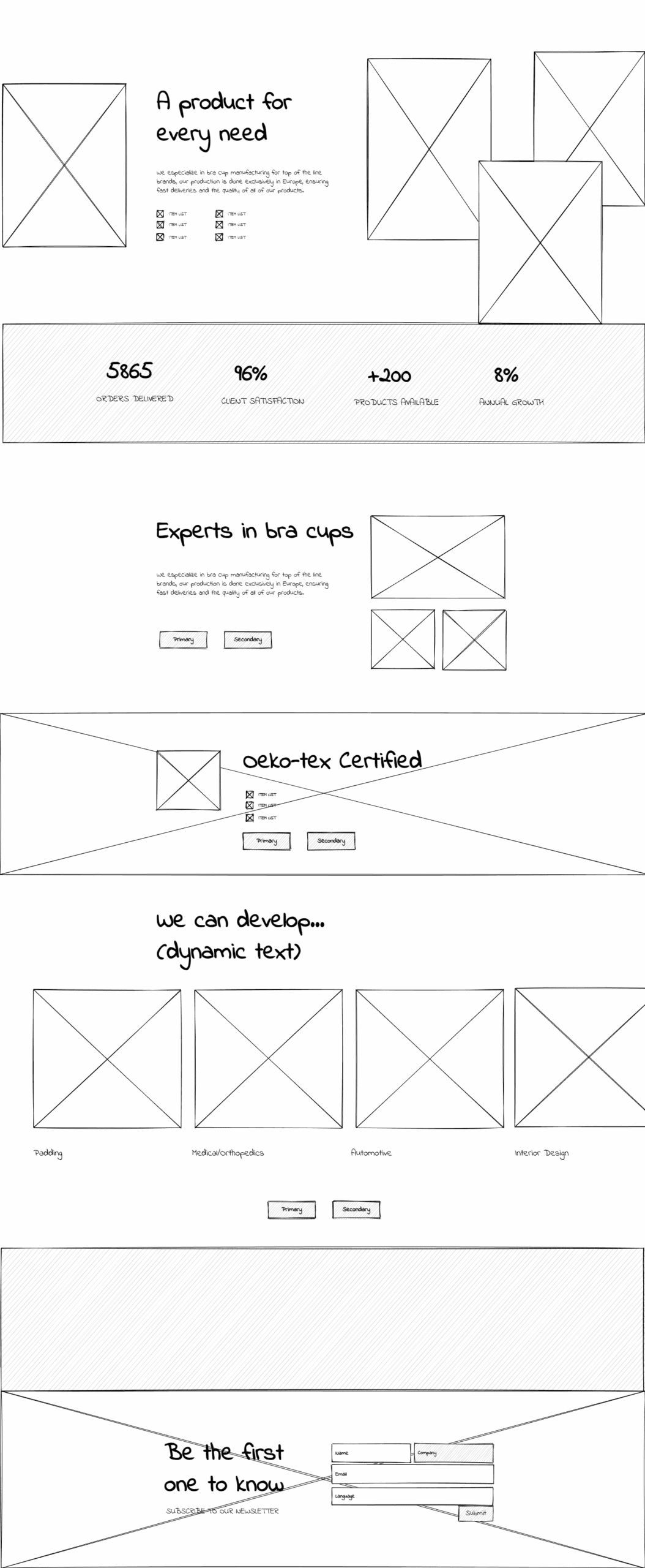
Website redesign & expansion
The website became the foundation for implementing the new identity digitally. I reorganized the site architecture to improve navigation and accessibility, ensuring that professionals could quickly find information about products and services. The design combines a functional layout with a renewed visual language, modern, clean, and aligned with the company’s positioning as a reliable European manufacturer.
Originally, we considered incorporating an online shop into the website. However, we decided to postpone this feature until the brand identity and all visual materials were fully aligned. Now that these foundations are in place, we have begun developing the e-commerce section, starting with Preformatex’s ready-to-ship products that do not require personalization.
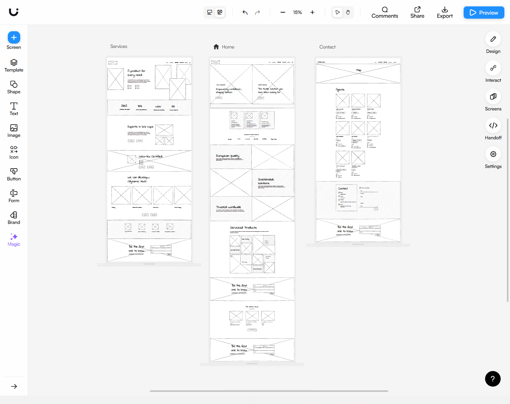
Content structure - Preformatex websiteMade with: Lucid

PLANNING
- Sitemap: defined the website structureand content
- Wireframes: outline layout, user flow, and key interactions
- WordPress: selected a scalable and cost-efficient platform
Low fidelity wireframes - Preformatex websiteMade with: Uizard
NOTES
- Reinforced brand credibility by showcasing logos from major industry clients
- Improved navigation structure and page hierarchy
- Added a direct link to the online catalog on the landing page
- Used the website to create leads, users subscribed to the newsletter or contacted Preformatex via online form
- Implemented analytics to track traffic, user behavior, and engagement across key pages, ensuring future improvements are data-driven.
Digital Communication
Beyond the website, I adapted the refreshed identity to the company’s digital presence. This included designing new email campaigns, creating LinkedIn and Instagram visuals, and ensuring visual and tonal consistency across all digital channels. Throughout this process, we emphasized the brand’s core value: high product quality, a key differentiator with most of its competitors. The goal was to convey a professional yet approachable image, focused on quality, innovation, and trust.
APPLICATIONS
- Newsletters, segmented campaigns
- Social media content
- Presentations, Banners & Graphics
- Online forms & Bookings for meetings
Task organizing and tracking:Made with: Notion
NOTES
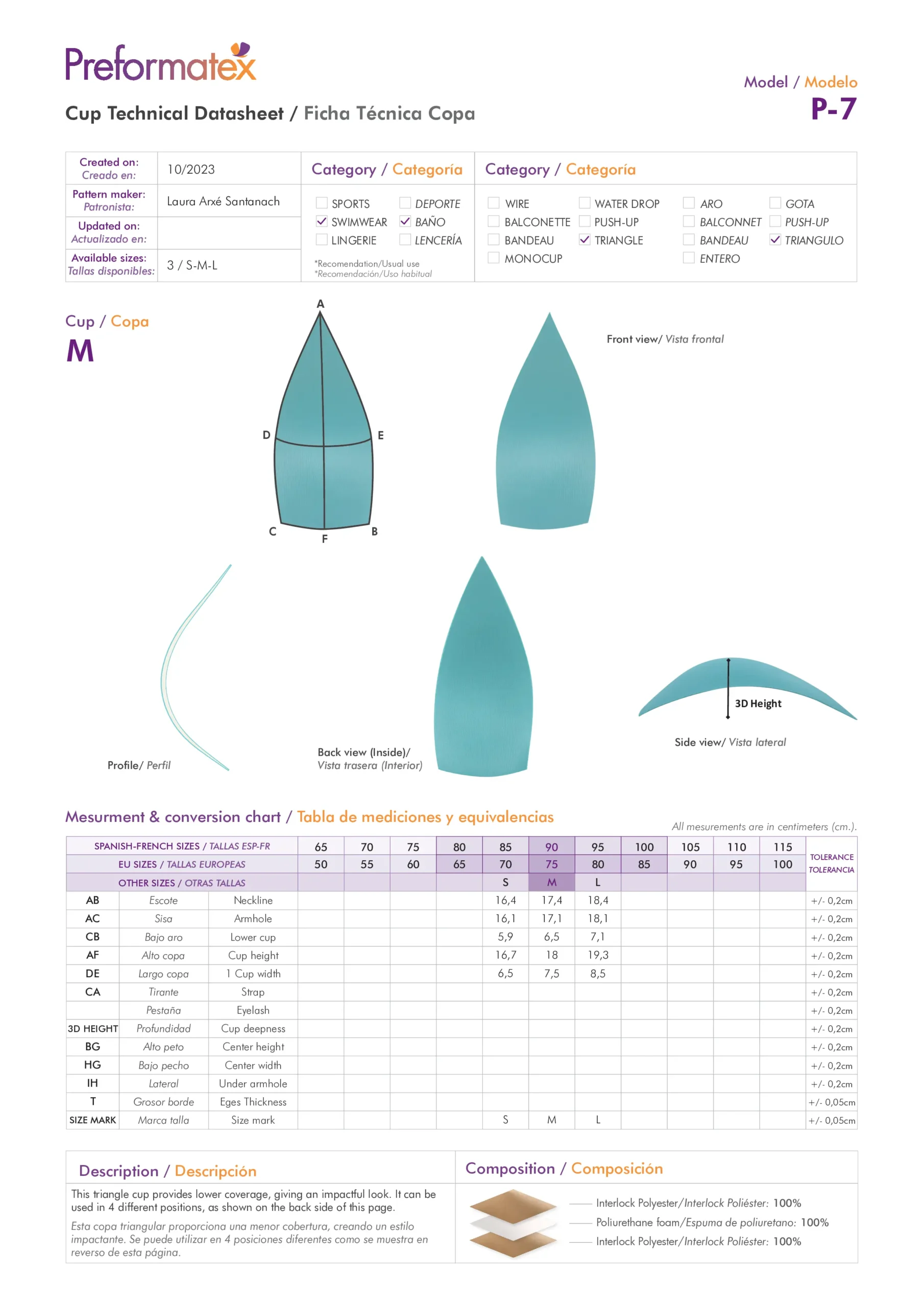
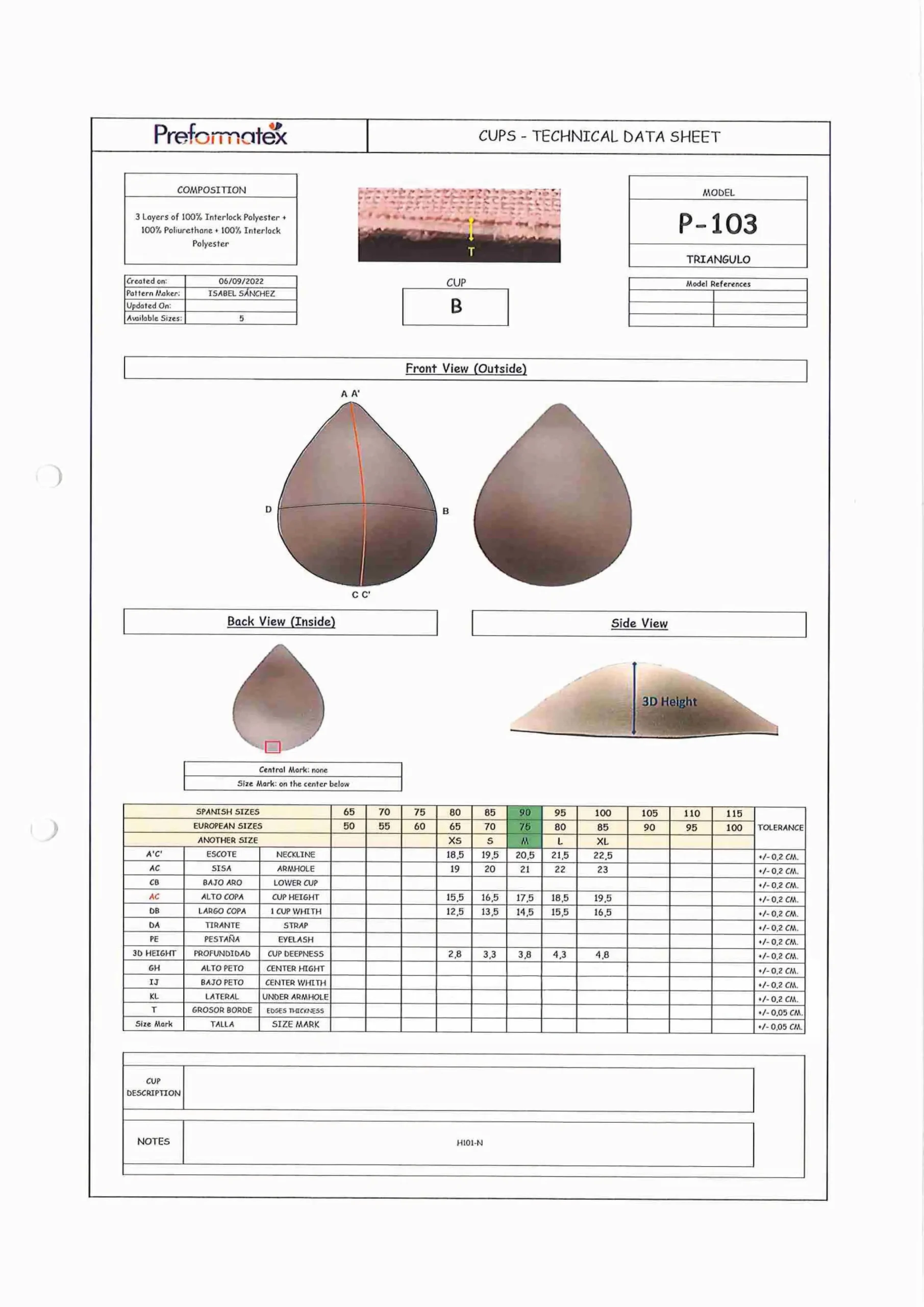
- Developed templates for letters and technical sheets, enabling the team to maintain a consistent and coherent brand identity
- Actively built a larger newsletter audience to increase reach and engagement over time
- Developed social media posts to promote trade fair participation and provide informative content that helps audiences better understand the products
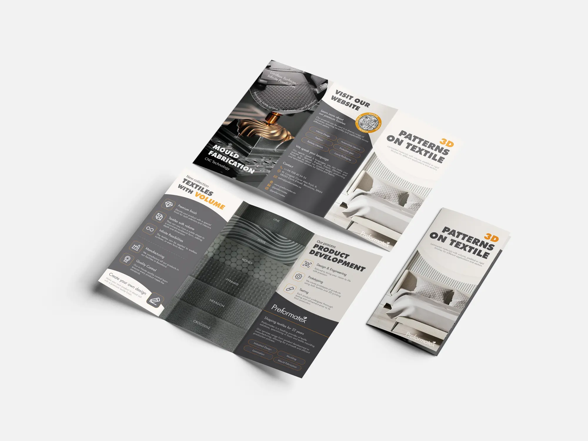
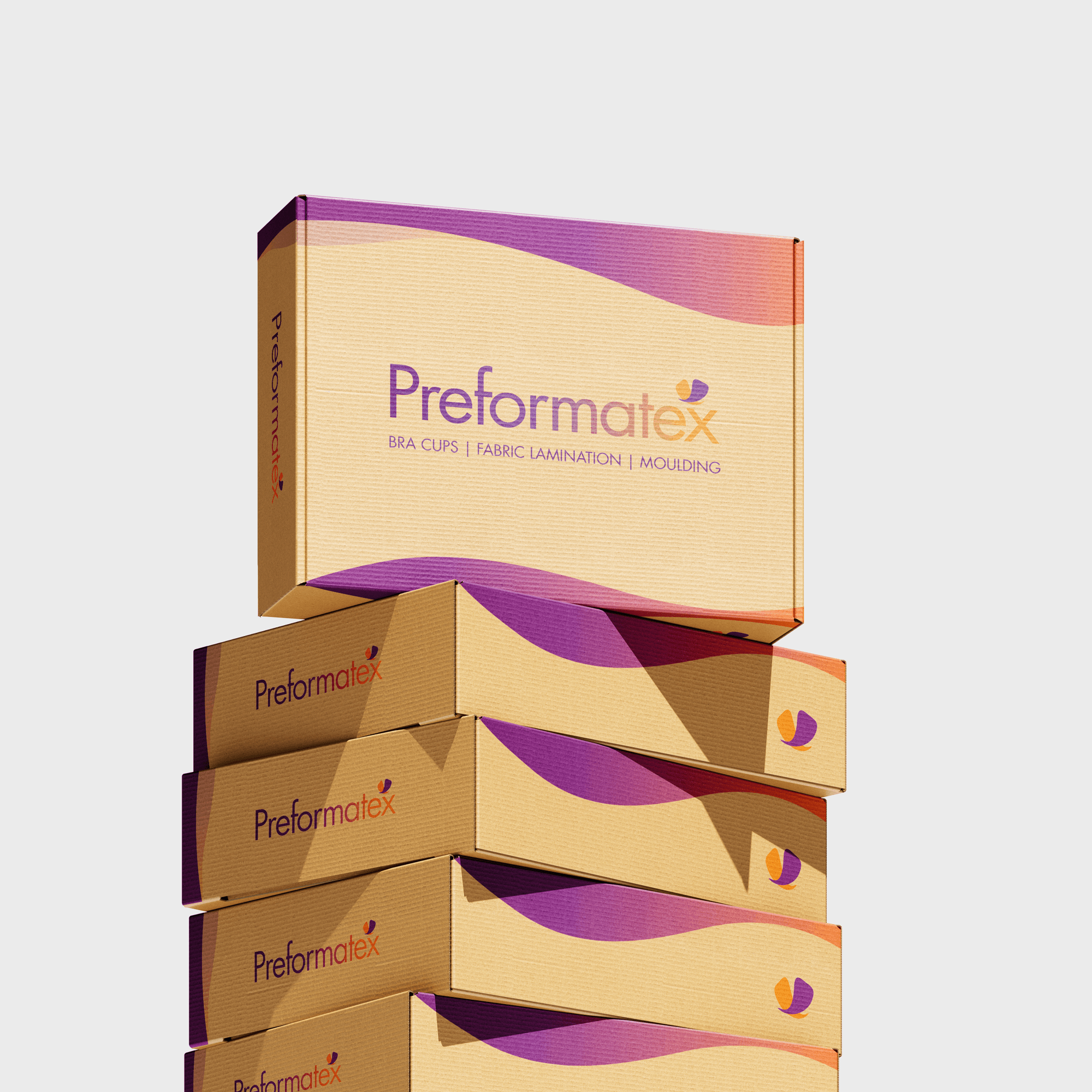
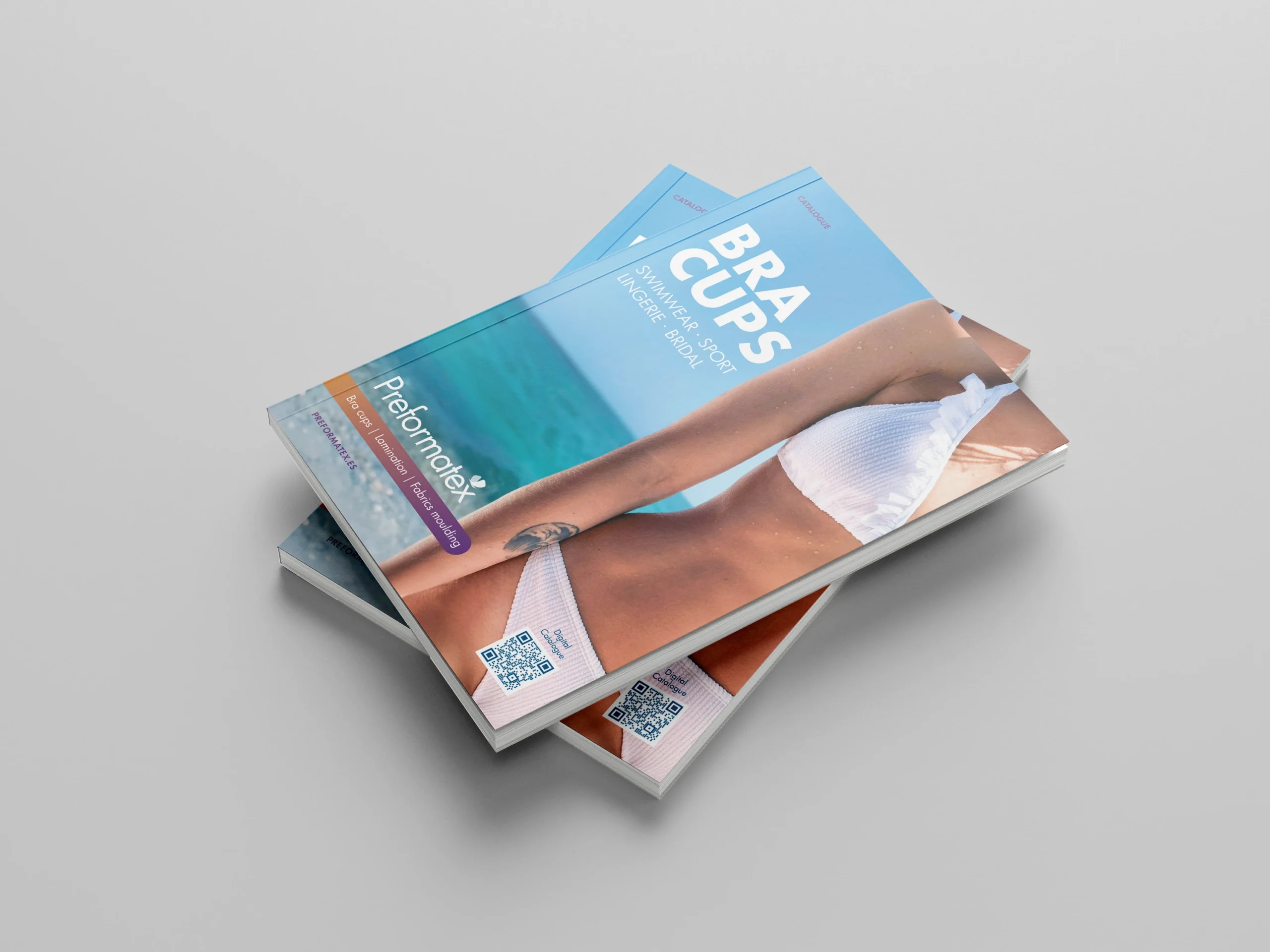
Print & Presence
The website became the foundation for implementing the new identity digitally. I reorganized the site architecture to improve navigation and accessibility, ensuring that professionals could quickly find information about products and services. The design combines a functional layout with a renewed visual language, modern, clean, and aligned with the company’s positioning as a reliable European manufacturer.
Originally, we considered incorporating an online shop into the website. However, we decided to postpone this feature until the brand identity and all visual materials were fully aligned. Now that these foundations are in place, we have begun developing the e-commerce section, starting with Preformatex’s ready-to-ship products that do not require personalization.
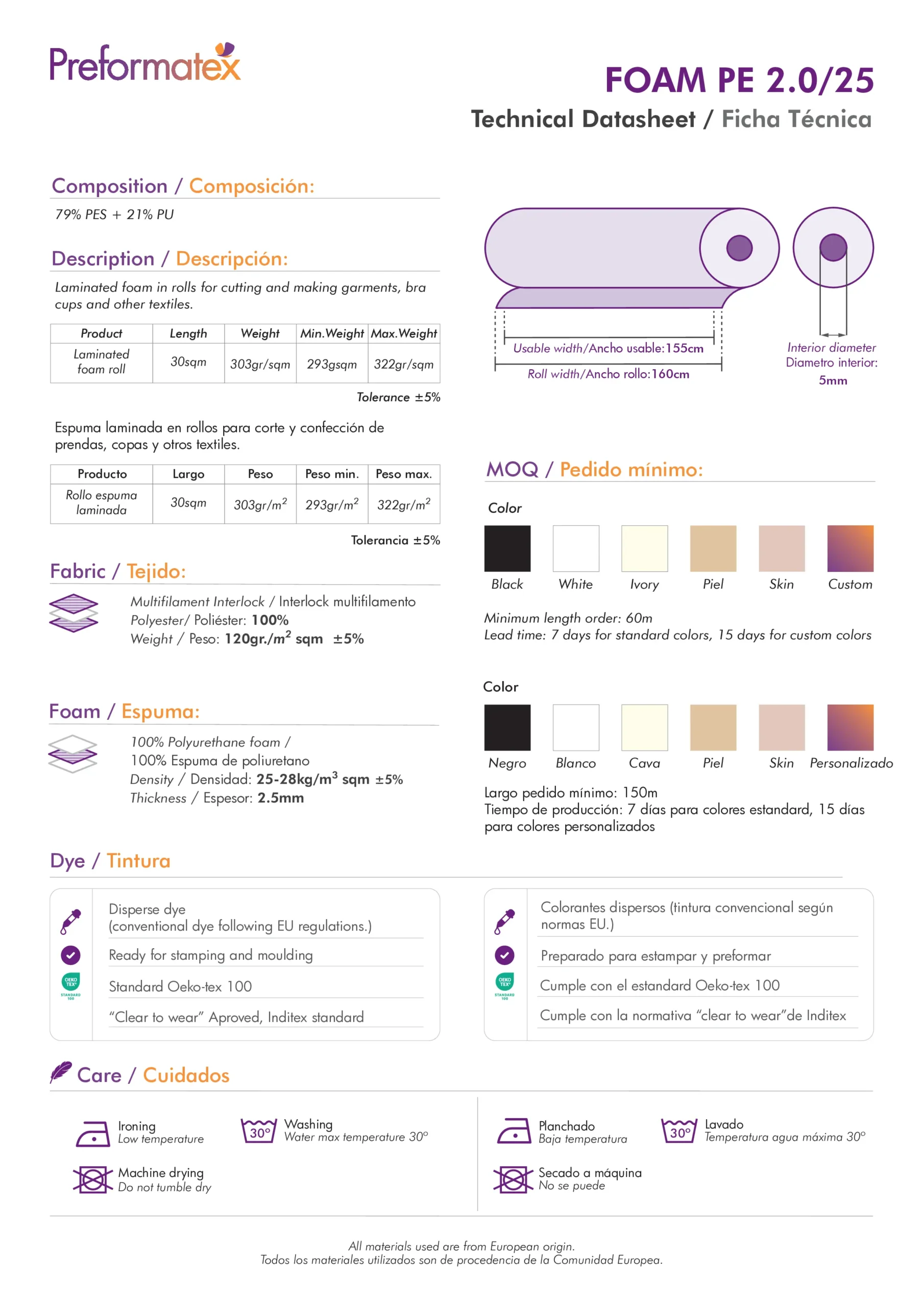
APPLICATIONS
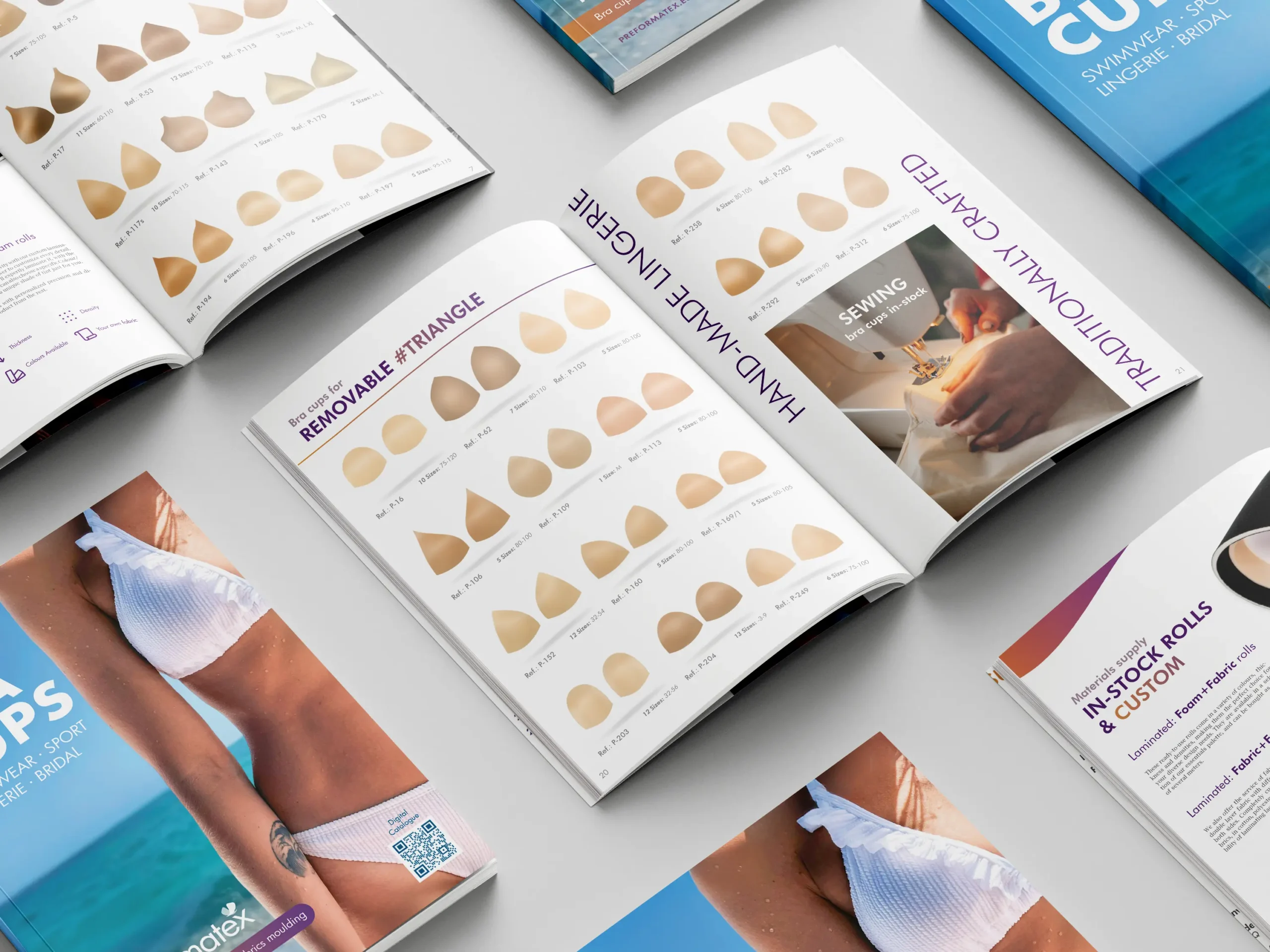
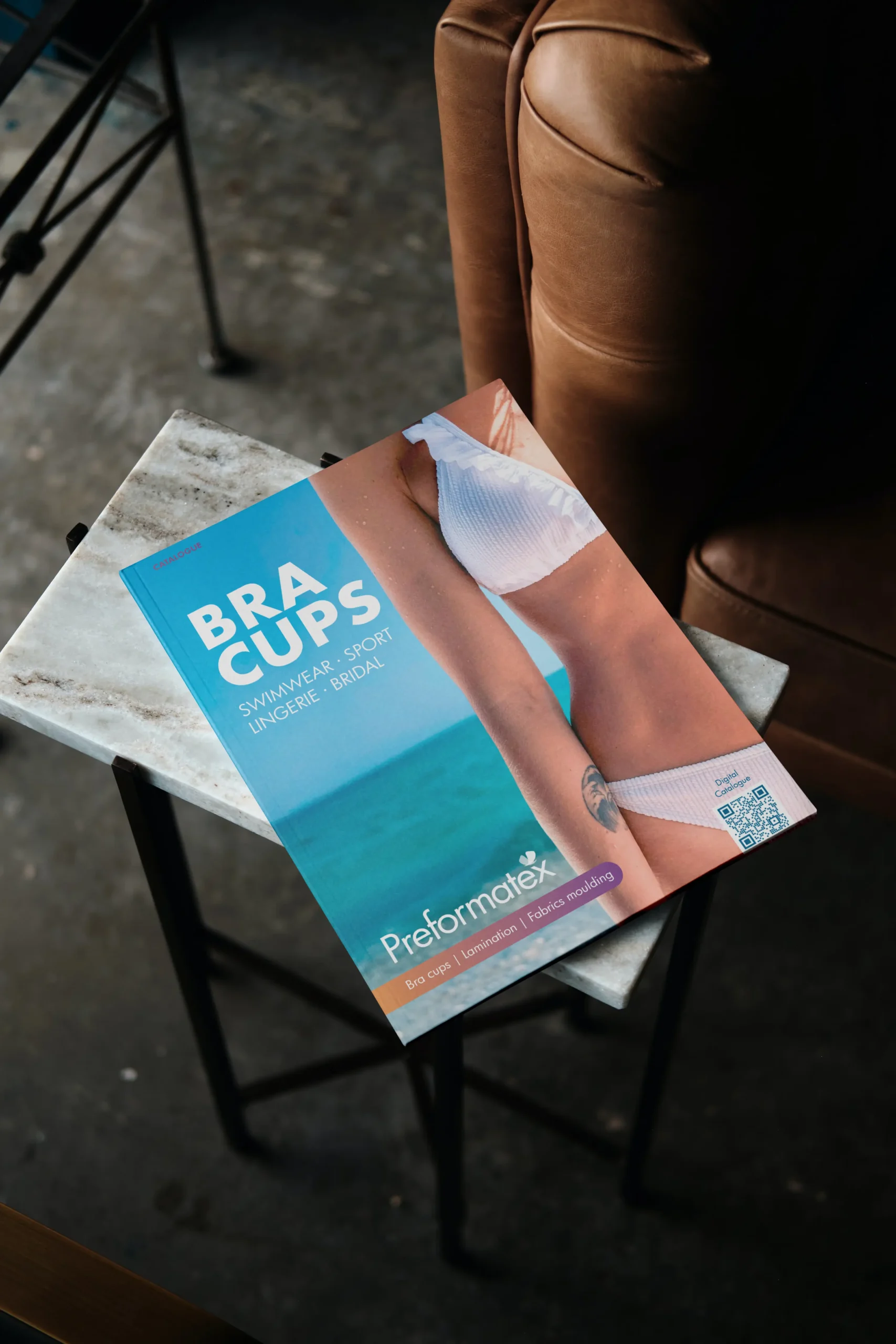
- Catalog & Flyers
- Stationary: Bussiness cards, Letter tamplates, Technical Sheets, Client forms, etc.
- Trade fairs: Booth design & Promotion
Brand moodboard:Made with: Canva

NOTES
- Linked physical and online presence via QR codes
- Created themed booths to gain visibility on each trade fair
- Improved packaging presentation for product samples
Helping Preformatex grow through
Results
WEBSITE RESULTS
RE-DESIGN & CONTENT EVOLUTION
The website now serves as a cohesive extension of the brand, clean, informative, and aligned with the company’s professional image.
- Clear navigation and hierarchy improved the user experience for B2B clients
- Simplified access to key information (products, services, catalog, contact) reduced user friction
- Consistent use of typography, color, and imagery strengthened brand perception
- Improved SEO structure and keyword usage, increasing visibility in search results
- Data compilation and measured statistics via Google Analytics helped quantify improvements across traffic, performance and engagement
- Adding a blog section helped attract new traffic to the website by offering industry-relevant insights and showcasing the company’s expertise from a professional perspective.
- The company catalog is now easily accessible and downloadable from key areas of the website
%
Increase in Organic Search Traffic after SEO Imprementation
%
Increase in website traffic
%
Increase in time spent on key pages
%
Improvement in page load speed after optimization
%
Increase in catalog downloads


DIGITAL MEDIA
RE-DESIGN & CONTENT EVOLUTION
Through redesigned templates, clearer messaging, and consistent branding, digital communication became more coherent and professional. Social media now supports regular updates, trade fair announcements, and product education.
The brand also gained visibility in sector-specific press such as Pinker Moda and Intima Magazine, and I created visuals and copy for trade-fair newsletters, strengthening Preformatex’s presence in organizers’ promotional materials.
- Newsletter audience grew steadily after restructuring content and templates
- Improved engagement on Instagram and LinkedIn through consistent branding
- Increased visibility around trade fairs through targeted and timely communication
- Expanded brand presence in industry media
- Reduced search time and organizational bottlenecks by establishing a structured cloud-based archive for technical sheets and essential documents
%
Increase in email click-through rates
Catalog visualizations
%
Email opening rate
%
Increase in social media impressions
PRINT & PRESENCE RESULTS
KEY TAKEWAYS
Printed and physical materials were expanded and redesigned to align with the refreshed identity and the company’s evolving needs.
Beyond updating existing assets, new tools such as order blocks, sample testing files, hangers, and presentation documents were created to support both commercial and operational workflows. The strengthened visual system ensured that catalogues, stationery, and trade fair materials all projected a consistent, professional, and recognizable brand presence..

- Increase in inquiries during and after trade fairs thanks to the updated booth presence and printed materials
- Creation of branded materials & accessories for products or presentations
- Booth designs: Mare di Moda, Cannes / Interfilére, Paris / TechTextil, Frankfurt / Swimwear Barcelona, BCN
- Improved internal efficiency in document preparation through standardized templates
Catalog copies distributed across trade fairs and client visits
Catalog copies distributed across trade fairs and client visits
Catalog copies distributed across trade fairs and client visits
Catalog copies distributed across trade fairs and client visits
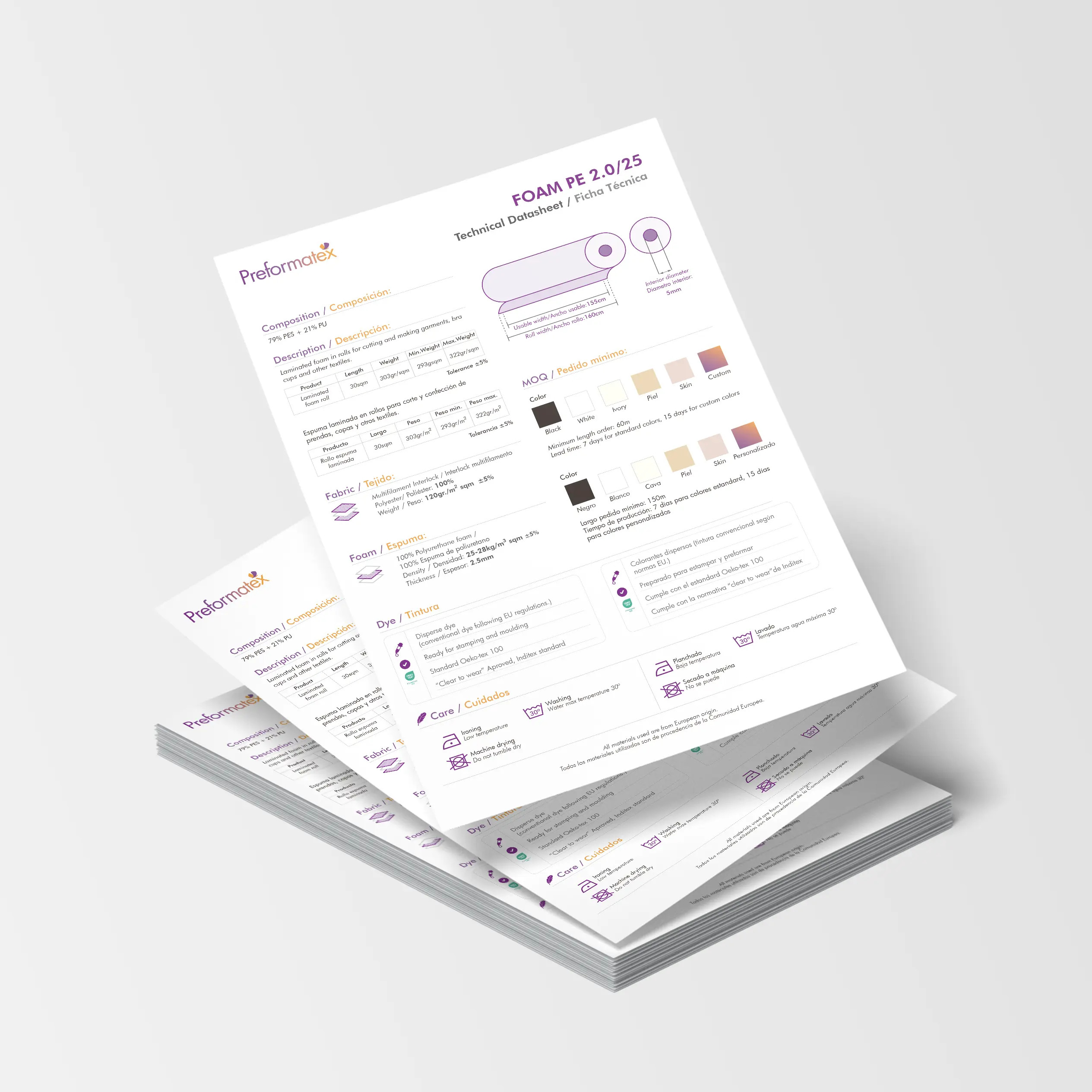
Before and After design of Technical DatasheetsTemplate: Adobe Illustrator

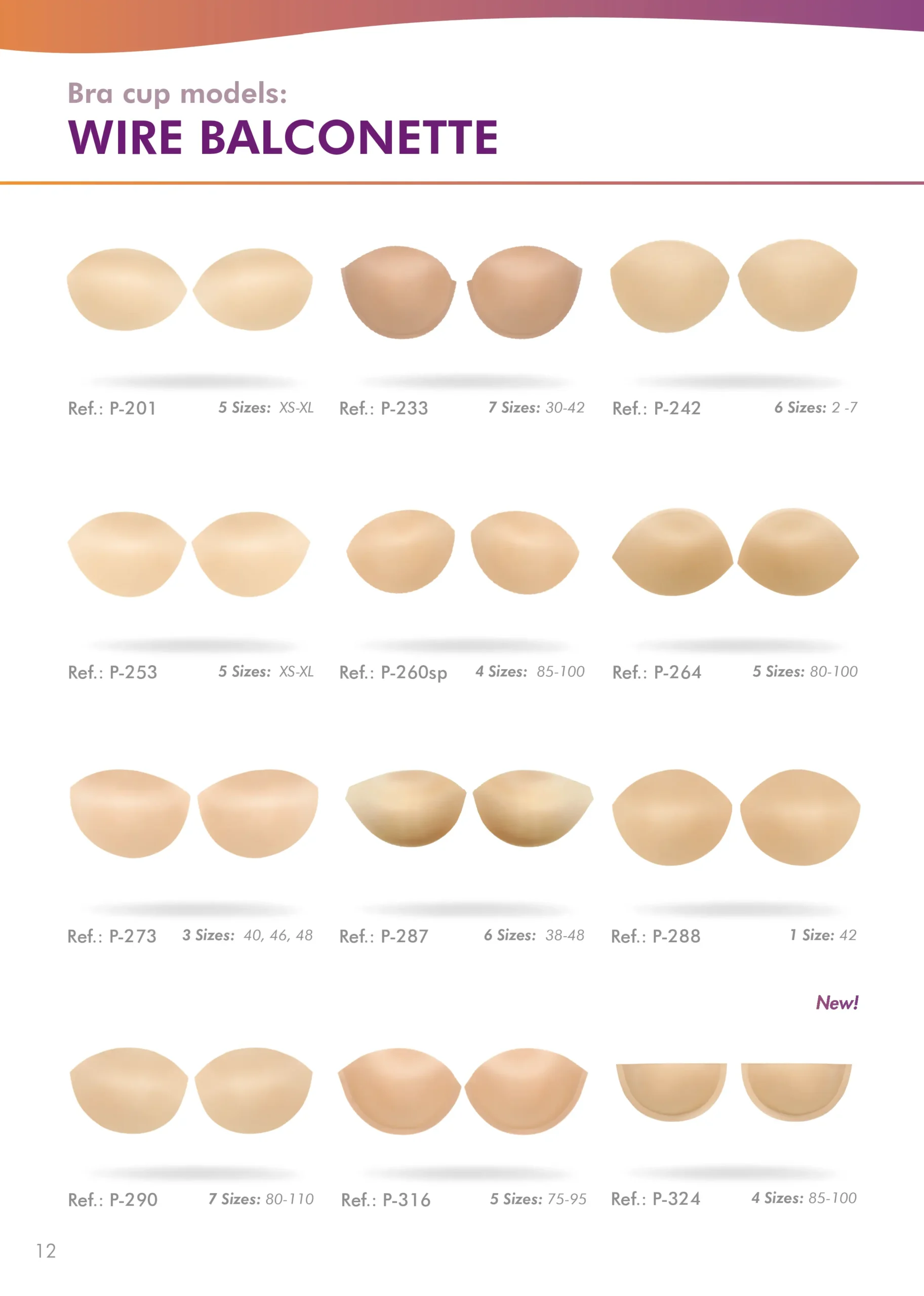
Before and After design of Product CatalogEdited: InDesign, Photoshop & Lightroom

PREFORMATEX
What I learned:
Over these two years, I learned that design is never finished, there’s always room to improve and evolve. Once we achieved our initial goals, I kept searching for new ways to make an impact, from refreshing visuals and materials to creating new advertising approaches. This experience strengthened my adaptability and showed me how small, consistent improvements can shape a brand’s growth.
THE FUTURE OF THE PROJECT:
A strong foundation has now been established for Preformatex’s visual identity and digital presence. Although I’ve moved on to new professional challenges, I continue to collaborate with the team on key areas of their communication, refining trade fair booths, updating catalogues, and enhancing website content as the brand evolves. Our next big step is adding an online shop to the website using WooCommerce.


